# Signal Forms
> Signal form components: sg-form, sg-input, sg-date-input, sg-textarea, sg-select, sg-search, sg-checkbox, sg-switch, sg-radio-group and sg-tag-input.
Source: https://sendbroadcast.net/docs/signal-forms
> Coming in Broadcast 3.0. Until then, this page applies only to the Upcoming (edge) build.
A plugin page cannot post a normal HTML form, because the sandbox forbids it. `sg-form` solves this. It checks the fields and hands you the values in an event.
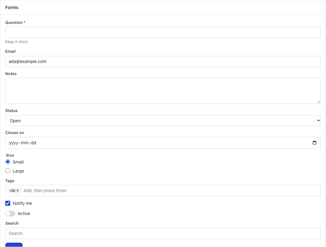
## How a form works
```html
Save
```
```javascript
const form = document.getElementById("form");
form.addEventListener("sg-submit", async (event) => {
const { question, active } = event.detail.values;
form.busy = true;
await sg.pageData({ action: "save", question, active });
form.busy = false;
sg.toast("Saved");
});
```
Each field needs a `name`. That name is the key in `values`.
## sg-form
| Property or method | Meaning |
|---|---|
| `values` | Read. An object of all named fields |
| `errors` | Set. `{ name: "message" }` shows each message under its field. An empty object clears them |
| `busy` | Set. Turns the submit button off and on |
| `reset()` | Puts each field back to its starting value, and clears the errors |
| Event | `detail` | When |
|---|---|---|
| `sg-submit` | `{ values }` | A person submitted, and all checks passed |
When a check fails, the form shows a message under the field, moves the focus there and sends no event.
## What every field can do
All ten field types share these:
| Attribute, property or method | Meaning |
|---|---|
| `name` | The key in the form's values |
| `required` | Must have a value. A checkbox or switch must be on, a radio group needs a choice, and a tag input needs one tag |
| `value` | Live. Read or set it, also before the field is on the page |
| `error` | Set it to show a message under the field, also before the field is on the page. Empty text clears it |
| `check()` | Returns `true` if the field passes its checks |
| `problem()` | Returns the message for a failed check |
| `reset()` | Puts back the starting value, and clears the error |
| Field | Value type |
|---|---|
| `sg-input`, `sg-textarea`, `sg-select`, `sg-search`, `sg-date-input` | A string |
| `sg-radio-group` | A string, or `""` |
| `sg-checkbox`, `sg-switch` | `true` or `false` |
| `sg-tag-input` | A list of strings |
**Common mistakes.**
- A field with no `name`: it is not in `values`.
- Trusting browser checks alone: check again in `pageData`.
## Attributes of text-style fields
`sg-input`, `sg-textarea`, `sg-select`, `sg-date-input` and `sg-search` share these:
| Attribute | Meaning |
|---|---|
| `name` | The key in the form's values |
| `label` | The text above the field |
| `help` | Small text below the field |
| `value` | The starting value |
| `placeholder` | Grey text in an empty field |
| `required` | Must have a value. Adds a red star |
| `disabled` | Turned off |
| `readonly` | Can be read, not changed |
| `maxlength`, `min`, `max`, `pattern`, `rows` | Passed to the real control |
| Property | Meaning |
|---|---|
| `input` | The real `` element, after the field is on the page |
## sg-input
A one-line text box.
```html
```
| Extra attribute | Default | Meaning |
|---|---|---|
| `type` | `text` | Any input type, such as `email`, `number`, `url` or `password` |
**Common mistake.** `value` from `type="number"` is still a string. Use `Number()`.
## sg-date-input
A date picker.
```html
```
The value looks like `2026-11-30`, or it is `""`.
## sg-textarea
A box for several lines.
```html
```
## sg-select
A dropdown list.
```html
Open
Closed
```
Each child is an option, with `value` and optional `selected`. Without `value`, the text is the value.
To fill it from data:
```javascript
document.getElementById("status").options = [
{ value: "open", label: "Open" },
{ value: "closed", label: "Closed" },
];
```
## sg-search
A search box that waits until a person stops typing.
```html
```
```javascript
document.getElementById("search").addEventListener("sg-search", (event) => {
applyFilter(event.detail.value);
});
```
| Extra attribute | Default | Meaning |
|---|---|---|
| `delay` | `250` | Milliseconds to wait after the last key |
| Event | `detail` | When |
|---|---|---|
| `sg-search` | `{ value }` | Typing stopped |
**Common mistake.** Listening for `input`. Listen for `sg-search`, so that you do not run a search for each key.
With a `label`, it shows a visible label. Without one, screen readers still get the word "Search".
## sg-checkbox
One yes or no choice, saved later with a form.
```html
```
| Attribute | Meaning |
|---|---|
| `name`, `label`, `required` | As above |
| `checked` | On at the start |
| `disabled` | Turned off |
| Property | Meaning |
|---|---|
| `checked`, `value` | Live. Read or set `true` or `false` |
| Event | `detail` | When |
|---|---|---|
| `sg-change` | `{ checked }` | A person changed it |
## sg-switch
Looks like a light switch. It has the same attributes, properties and event as `sg-checkbox`.
```html
```
Use a switch for a setting that applies at once, and a checkbox in a form that has a Save button.
## sg-radio-group
Pick one from a short list.
```html
Small
Large
```
| Attribute | Meaning |
|---|---|
| `name`, `label`, `required` | As above |
Each child is one choice, with `value` and optional `checked`.
| Property | Meaning |
|---|---|
| `value` | Live. Read or set the chosen value |
| Event | `detail` | When |
|---|---|---|
| `sg-change` | `{ value }` | A person chose |
**Common mistake.** Using radios for more than about five choices. Use `sg-select`.
## sg-tag-input
Type a word and press Enter or a comma, and it becomes a tag. Backspace in an empty box removes the last tag.
```html
```
| Attribute | Default | Meaning |
|---|---|---|
| `name`, `label`, `help`, `required` | | As above |
| `value` | | A JSON list. Use single quotes around it |
| `placeholder` | `Add, then press Enter` | The hint in the box |
| Property or method | Meaning |
|---|---|
| `value` | Live. Read or set a list of strings |
| `add(text)` | Adds one tag |
| Event | `detail` | When |
|---|---|---|
| `sg-change` | `{ value }` | The tags changed |
**Common mistake.** Text typed without Enter is not a tag, so it is not in the value.