The Page After the Click Is Part of Your Brand Too
Double opt-in has a moment nobody designs. Someone signs up, gets your confirmation email, clicks the link, and lands on a page rendered by your email software, in your email software’s words, looking like your email software.
You spent real effort on the form. You wrote the confirmation email. And the page at the end of the funnel, the one that confirms the whole thing worked, says something generic that you didn’t write and can’t change. It’s the last impression of the signup flow and it belongs to your vendor.
Version 2.8 hands it back.
Six states, because there are six things that can happen
The interesting part isn’t “you can edit the confirmation page”. It’s that there is no single confirmation page. A confirmation link can resolve six different ways, and lumping them together is why generic copy feels generic.
Confirmed successfully. Already confirmed (they clicked twice, or the link was in two places). Expired. Invalid. And so on: six distinct outcomes, each with its own heading and body text that you write.
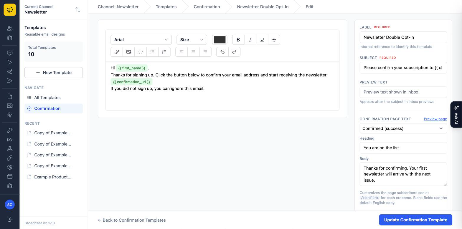
It’s a state selector in the confirmation template’s sidebar: pick the outcome, write what that outcome should say. Leave a field blank and it falls back to the default English copy, so you can customise only the two states that matter to you and ignore the rest.
That distinction matters more than it looks. “You’re confirmed: your first issue arrives Tuesday” and “You already confirmed this address, so you’re all set” are genuinely different messages. One is a welcome. The other is reassurance for someone who thinks they might have broken something. Serving the same paragraph to both is how software ends up feeling careless.
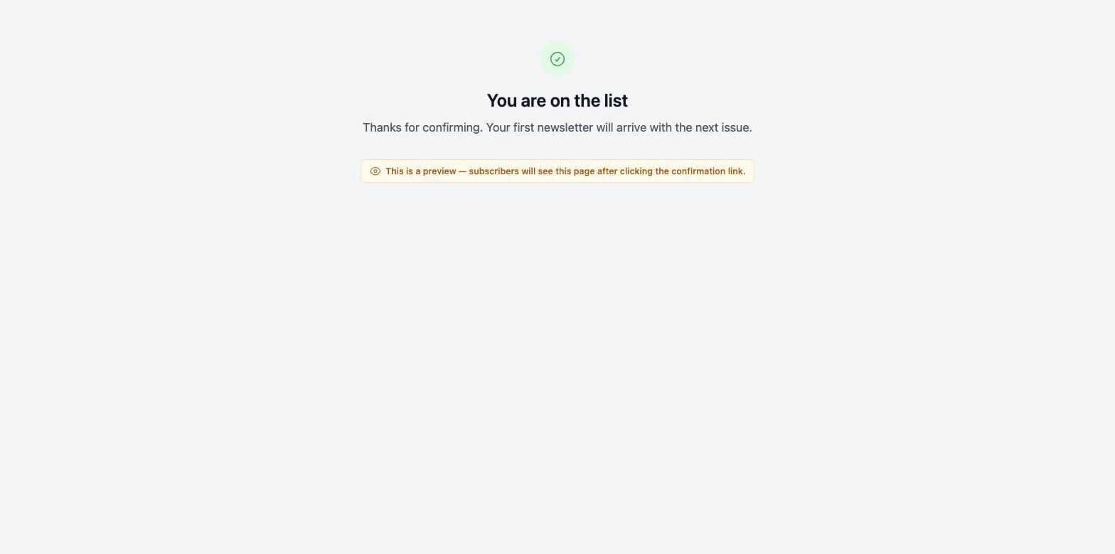
Or skip the page entirely
Sometimes the right confirmation page isn’t a confirmation page. It’s a page on your own site. A thank-you page with your navigation, your next call to action, and your analytics on it.
Opt-in forms with double opt-in enabled now have an After Confirmation URL field. Fill it in and confirmed subscribers get redirected there instead of seeing Broadcast’s page at all.
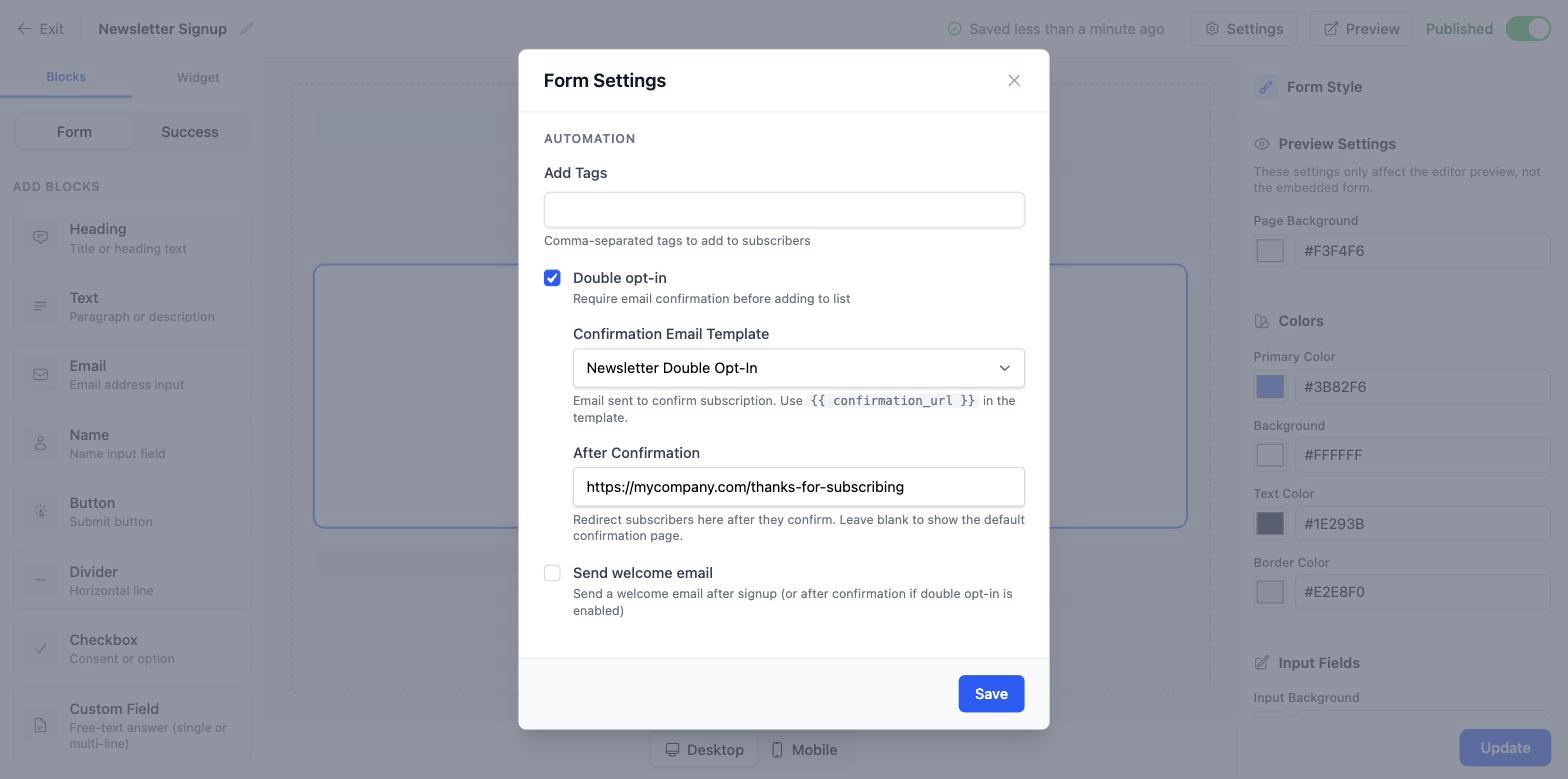
This is the option I’d pick for most marketing sites. Your confirmation page is a conversion opportunity (the visitor has just demonstrated intent twice) and a dead-end page saying “confirmed” wastes it. Send them to a welcome page with a link to your best article, or a discount code, or the thing they actually signed up for.
Three ways to use it
Set expectations at the exact moment they’re wondering. “You’re on the list. The next issue goes out on the first Tuesday of the month.” Answers the question they’d otherwise have to guess at, in the one second where they’re looking.
Make the double-click case reassuring. People forward confirmation emails, click twice, come back later. The already confirmed state should say “you’re fine, nothing to do”, not something that reads like an error and prompts a support email.
Turn confirmation into a conversion. Redirect to a page on your site with your next step on it. The lead magnet, the onboarding video, the discount. You have their attention and their trust at the same instant, which basically never happens twice.
The rest of 2.8
Channels gained a Language setting under Settings → General, currently English-only but with the infrastructure for translations behind it: the groundwork for these subscriber-facing pages eventually speaking your audience’s language rather than mine.
A bug worth naming: confirmation pages for opt-in form subscribers never showed the custom text set on the form’s confirmation template. Custom text existed, was saved, and was ignored, which is the most frustrating class of bug, because the person who hit it did everything right. Fixed. The logo on confirmation and error pages is now centred too.
On the documentation side, the docs got a global search modal you can open from any page, and old nested documentation URLs now redirect to their new flat slugs so links people bookmarked or shared keep working.
2.8.1 followed the next day and moved the whole thing into the API: per-state page text, redirect URLs, default confirmation templates, and template assignments on opt-in forms can all be managed programmatically. Everything you can configure in the admin UI, you can configure from code, which is the rule Broadcast tries to hold to generally, and the reason an AI agent can drive the platform as well as a person can.
See the confirmation pages documentation, or read Double Opt-In Without the Straitjacket for the whole opt-in flow end to end.