Opt-In Forms
Opt-in forms are the signup forms you put on your own website. A visitor fills one in, and Broadcast creates the subscriber in the channel that owns the form, applies your tags, and optionally sends a confirmation or welcome email.
Each form is built from blocks in a visual editor, styled without CSS, and installed with a single script tag.
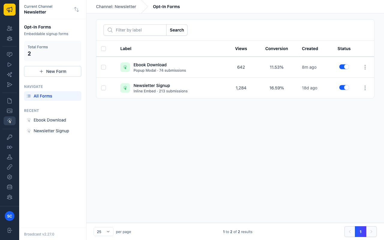
The list shows every form in the current channel with its view count, conversion rate, and an on/off toggle. Use Filter by label to search, or the checkboxes to enable and disable forms in bulk.
Choosing a Widget Type
Click New Form and pick how the form should appear on your page. The choice determines which display settings you get later, and you can change it at any time from the editor’s Widget tab.
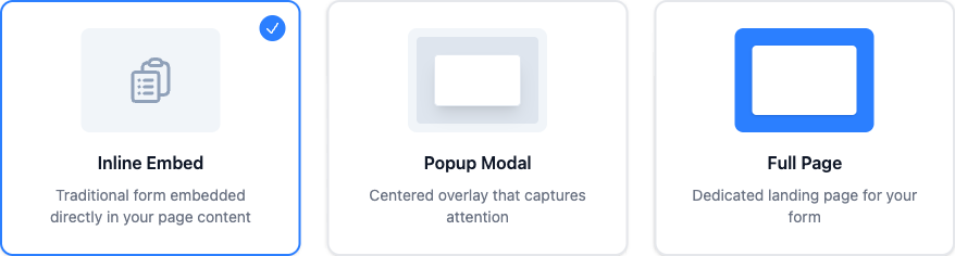
| Widget type | Where it appears | Best for |
|---|---|---|
| Inline Embed | In the flow of your page content, where you put the script tag | Sidebars, end-of-post signup, footers |
| Popup Modal | A centered overlay on top of the page | Lead magnets and offers that need attention |
| Full Page | A dedicated page of its own, linked directly | Landing pages and campaign links |
The Form Builder
Opening a form takes you to a three-pane editor: blocks on the left, a live canvas in the middle, and properties on the right.
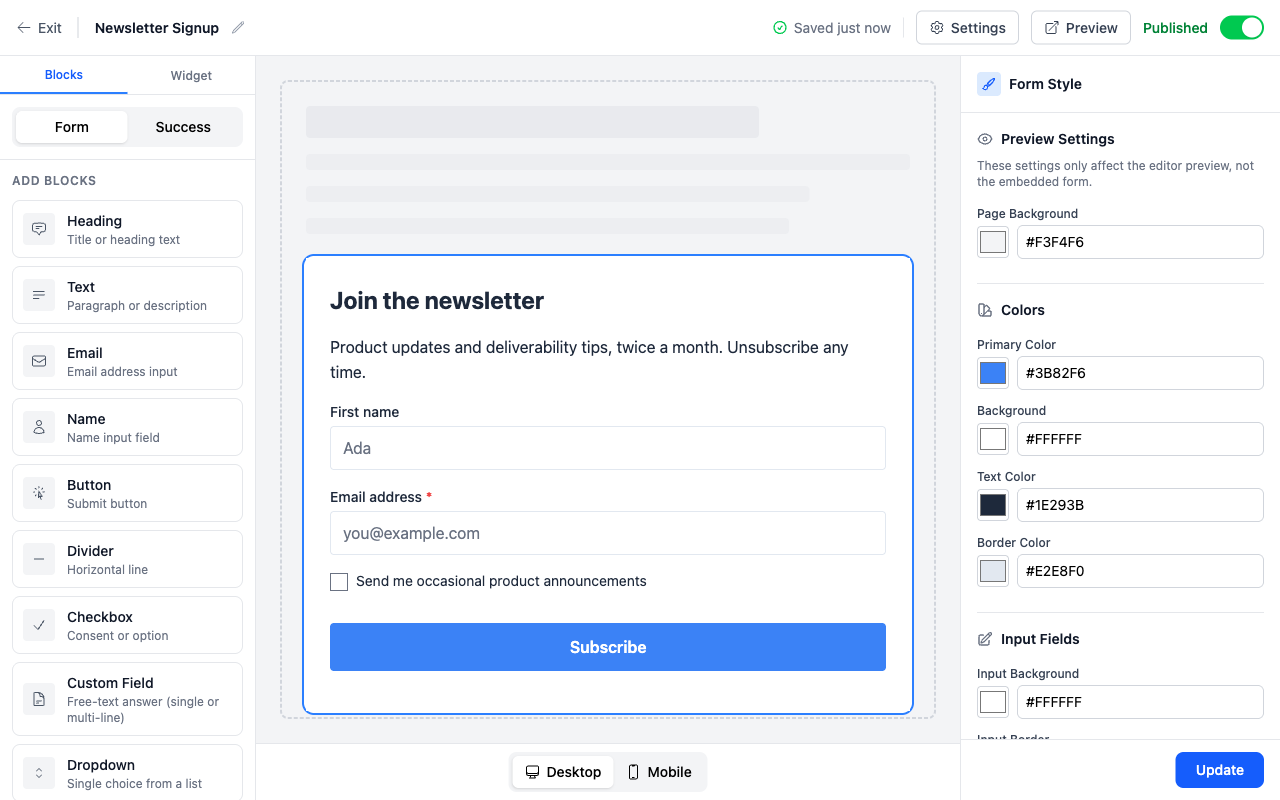
Your work saves automatically, which the header confirms with Saved just now. The Published toggle in the top right controls whether the form accepts submissions, and it is the same switch as the status toggle on the list page.
Adding Blocks
The left panel lists everything you can drop onto the canvas. Click a block to append it, then drag it by its handle to reorder.
There are twelve block types, falling into three groups:
| Group | Blocks | Notes |
|---|---|---|
| Content | Heading, Text, Image, Divider, Spacer | Presentation only, collects nothing |
| Input | Email, Name, Checkbox, Dropdown, Radio Group, Custom Field | Each one writes to a subscriber field |
| Action | Button | Submits the form |
Note
Every form needs an Email block and a Button block. Without an email input there is nothing to create a subscriber from, and without a button there is no way to submit.
Editing a Block
Click any block on the canvas and the right panel becomes its inspector. The fields shown depend on the block type.
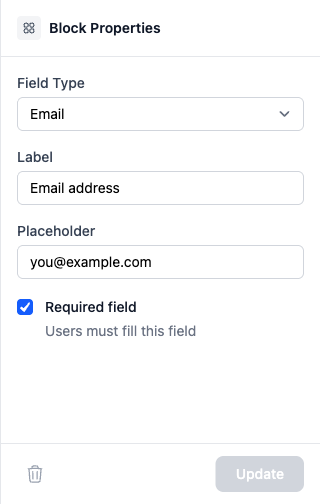
Input blocks all share a Label, a Placeholder, and a Required field switch. What differs is where the answer is stored.
Where Answers Are Stored
Standard input blocks map onto the subscriber’s own columns. Anything else goes into custom data.
| Field type | Stored as |
|---|---|
| The subscriber’s email address | |
| Name, First name, Last name | The matching subscriber name field |
| Custom Field, Checkbox, Dropdown, Radio Group | A key inside the subscriber’s custom data |
Custom keys must start with a letter and contain only lowercase letters, numbers, and underscores, so signup_source is valid and Signup Source is not. Use the same key across forms and you can segment on it later. See Managing Subscribers for how custom data is used elsewhere.
A “Select all” Checkbox
A checkbox whose key ends in _all acts as select all for every checkbox that shares the start of its key. For example, with checkboxes keyed city_markham, city_vaughan and city_richmond_hill, add one more keyed city_all and label it “All cities”.
- Ticking
city_allticks everycity_checkbox and locks them, so the reader can see what they chose. - Only
city_allis submitted, not the individual cities. So a segment for “everyone interested in Markham” should matchcity_markhamorcity_all; matchingcity_markhamalone misses the people who ticked all of them. - Unticking it unlocks the group and restores whatever the reader had ticked before.
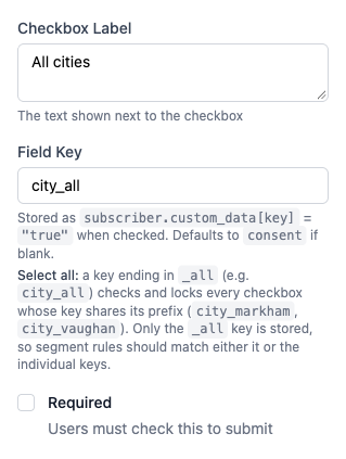
The checkbox inspector explains the convention under the key field. Nothing else needs setting: the _all suffix is what turns it on.
Styling the Form
The Form Style panel restyles the whole form without touching CSS. Changes render on the canvas as you make them.
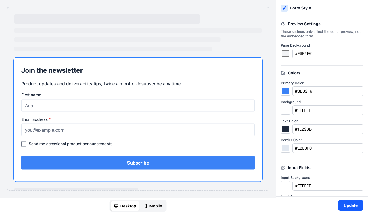
The panel is grouped into Colors, Input Fields, Typography, Layout, and Effects, and ends with four Quick Presets (Minimal, Bold, Soft, and Dark) that set all of them at once. Start from a preset, then adjust.
Warning
Preview Settings at the top of the panel, including Page Background, only change the editor canvas. They are there to help you judge contrast against your real site, and they are never applied to the embedded form.
Use the Desktop and Mobile buttons under the canvas to check both widths before you publish.
The Success View
The Success tab switches the canvas to what a visitor sees after submitting. It has its own blocks, so you can write a proper thank-you message rather than relying on a default.
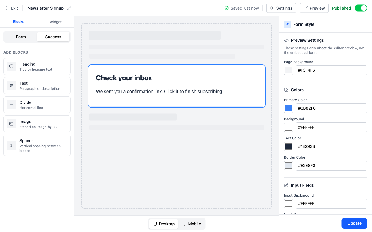
Only content blocks are offered here (Heading, Text, Divider, Image, and Spacer), because the visitor has already submitted and there is nothing left to collect.
If you would rather send people to a page on your own site, set an After Confirmation URL in the form settings instead.
Language of Broadcast’s own messages
Everything you put in the form’s blocks is shown exactly as you wrote it. What Broadcast adds around it follows the channel’s language: the thank-you shown when a form has no Success blocks of its own, the page title, and the messages when a submission cannot be accepted (an invalid email address, a submission sent too fast, too many attempts, a failed security check, or a field that is too long).
The language is the one the channel’s unsubscribe and confirmation pages use: the Default language under Settings > Unsubscribe Page, or the visitor’s browser language when Match the subscriber’s browser language is on and it is one of the channel’s languages. See Unsubscribe Settings. This requires Broadcast 2.36.0 or later; earlier versions show these messages in English.
Display Settings
The Widget tab holds the settings specific to your chosen widget type. For an inline embed that is just width and maximum width. A popup modal has considerably more, including when it should appear.
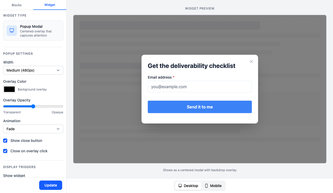
The preview beside the settings shows the result, overlay and all, so you can judge how intrusive a popup will feel before publishing it.
Triggers
Show widget decides what makes the popup appear:
| Trigger | Behaviour |
|---|---|
| Immediately | Shows as soon as the page loads |
| After a time delay | Waits 3, 5, 10, 15, 30, or 60 seconds |
| After scrolling | Waits until the visitor reaches 25%, 50%, 75%, or 90% of the page |
| On exit intent | Shows when the pointer leaves toward the browser chrome |
Show frequency decides how often the same visitor sees it again: every time, once per session, once every 1, 7, 14, 30, or 90 days, or once only. Frequency is tracked in the visitor’s browser, so it resets if they clear their cookies.
Show on devices lets you run a popup on desktop but not mobile, which is worth considering since mobile popups are both more intrusive and more likely to be penalised in search.
Installing the Form
The form’s detail page gives you two ways to install it.
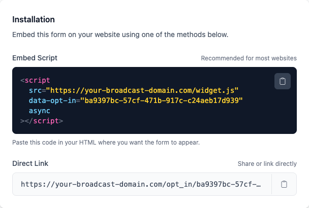
Embed Script
Paste the script tag into your HTML wherever the form should appear. This is the recommended method and the only one that supports popup triggers.
<script
  src="https://your-broadcast-domain.com/widget.js"
  data-opt-in="your-form-identifier"
  async
></script>
The script reads the form identifier from data-opt-in, fetches the form’s configuration, and renders it inside an iframe. The iframe matters: it means your site’s CSS cannot leak in and break the form’s styling, and the form’s styling cannot leak out and affect your page.
Direct Link
Every form also works as a standalone page at /opt_in/<identifier>. Share it in a bio link, a QR code, or an email, no embedding required. For a Full Page widget this is the primary way to use the form.
Form Settings
The Settings button in the editor header opens everything that is not about layout.
Automation
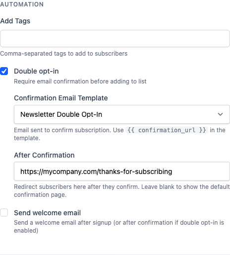
| Setting | What it does |
|---|---|
| Add Tags | Comma-separated tags applied to every subscriber from this form. Useful for tracking which form someone came from |
| Double opt-in | Requires the subscriber to confirm by email before they are added to the list |
| Confirmation Email Template | The template sent to confirm. It must include {{ confirmation_url }} |
| After Confirmation | A URL on your own site to redirect to after confirming. Leave blank to use Broadcast’s Confirmation Pages |
| Send welcome email | Sends a welcome template after signup, or after confirmation when double opt-in is on |
Note
Leave Double opt-in enabled unless you have a specific reason not to. It costs you some signups and buys you a list that actually engages, which is what your sending reputation is built on. See Confirmation Pages.
Allowed Embedding Domains
By default a form can be embedded on any domain. List one domain per line here and Broadcast will only render it on those domains. Set this once your form is live, so nobody can lift your script tag onto a site you do not control.
Security
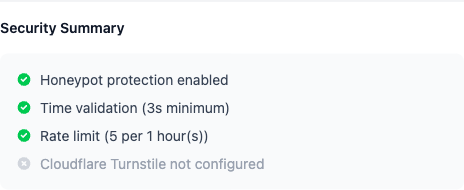
Public forms attract bots. Broadcast layers four defences:
| Defence | How it works | Default |
|---|---|---|
| Honeypot | A field invisible to humans. Anything that fills it in is a bot | On |
| Time-based validation | Rejects submissions faster than a human could type, with a configurable minimum | On, 3 seconds |
| Rate limiting | Caps submissions per IP address within a time window | On, 5 per hour |
| Cloudflare Turnstile | A privacy-preserving CAPTCHA alternative | Off |
Honeypot and time validation are invisible to real visitors, so leave both on. Turnstile needs a Cloudflare account and a site key, and is worth adding only if the first three are not holding.
The panel ends with a summary, which is the quickest way to confirm a form is actually protected rather than assuming it:
Tracking Performance
The form’s detail page summarises how it is doing.
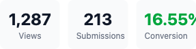
Views counts how many times the form was displayed and Submissions how many were completed, with Conversion the ratio between them. Below these, a Configuration panel restates the form’s key settings, so you can confirm at a glance that double opt-in is on and the right confirmation template is attached.
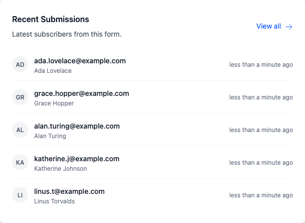
The same page lists the people who have signed up most recently.
What Visitors See
Use Preview in the editor header at any point to open the form exactly as a visitor gets it.
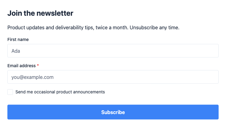
Always submit a test through the preview before you publish. It confirms the subscriber is created in the channel you expected, the tags land, and the confirmation email arrives.
Managing Forms
From the row menu on the list page you can:
- Edit to reopen the builder
- Preview to open the public form
- Duplicate to copy a form, including its blocks and styling, as a starting point
- Delete to remove it
Duplicating is the quickest way to run the same form with different copy on two parts of your site, and keeping them as separate forms means the view and conversion numbers stay separate too.
Disabling a form with the status toggle stops it accepting submissions while leaving the script tag in place. The embedded widget removes itself on the next page load.
Permissions
Access to opt-in forms is controlled by two channel permissions:
- View opt-in forms & performance (
opt_in_forms_read) to see forms and their analytics - Create & manage opt-in forms (
opt_in_forms_write) to build, edit, duplicate, and delete them
Both are included in the built-in Editor role. See Users & Permissions.
API Access
Everything above is available over HTTP, plus A/B variants, which are API-only and have no dashboard equivalent. See Opt-In Forms API for creating forms, reading per-form analytics, and splitting traffic across weighted variants.