Signal
Signal is the UI kit for plugin pages. It gives you 44 ready-made components, such as cards, forms, tables and dialogs. You write a few tags, and your page looks like part of Broadcast.
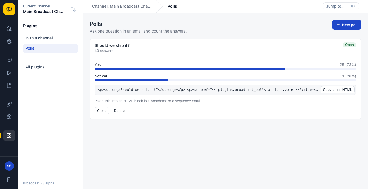
The picture shows the official Polls plugin. Everything to the right of the sidebar is a plugin page, built only from Signal.
Why Signal exists
Without a kit, each plugin author must solve the same problems:
- Each page looks different from Broadcast, and from every other plugin.
- The sandbox blocks inline styles and scripts, and a junior developer learns that the hard way.
- Talking to Broadcast needs
postMessagecode that is easy to get wrong. - Forms, tables, empty states and dialogs take days to get right, and more days to make accessible.
Signal solves all four. There is nothing to install and no build step.
The two lines that load it
Put these lines in the <head> of each page:
<link rel="stylesheet" href="/plugin-kit/v1/kit.css">
<script type="module" src="/plugin-kit/v1/kit.js"></script>
Then put your own script after them, and write tags in the body:
<script type="module" src="app.js"></script>
<sg-page title="Hello" description="A first page.">
  <sg-card title="Welcome">
    <p>This is a card.</p>
    <sg-button variant="primary">Save</sg-button>
  </sg-card>
</sg-page>
Your server serves these two files, so you never copy them into your plugin. Signal Quick Start builds a full page, step by step.
To see every component live, open /plugin-kit/v1/gallery.html on your Broadcast server.
The design language
Signal has opinions. If you follow them, your page feels at home in Broadcast.
One accent. Blue (--sg-accent) means “this is the thing to act on”. Do not add other brand colors. Green, amber and red are for meaning only: success, warning and danger.
Surfaces. The page is light grey. Content sits on white cards with a thin border. Use a card to group one topic. Do not put a card in a card.
One radius. Controls have 8px corners, and cards have 10px. This comes with the components, so do not change it.
One primary action on each page. A page has one main thing to do, and only that button is blue. Everything else is a default or ghost button. If two buttons are blue, nothing stands out.
Plain words. Write “Delete poll”, not “Confirm” or “Proceed”. A button says what it does. An error says what went wrong and what to do next.
Page anatomy
Most full pages have the same shape:
+----------------------------------------------------------+
|  Title                                   [Primary action] |  sg-page
|  One line that says what this page is for                 |
|                                                           |
|  +-----------------------------------------------------+  |
|  | Card title                              [Small act]  |  |  sg-card
|  |-----------------------------------------------------|  |
|  | Content: a form, a table, a list or some stats       |  |
|  +-----------------------------------------------------+  |
|                                                           |
|  +-----------------------------------------------------+  |
|  | The next topic                                       |  |
|  +-----------------------------------------------------+  |
+----------------------------------------------------------+
Three states for each screen
Each screen that shows data has three states. Plan all three:
| State | Use |
|---|---|
| Loading | sg-skeleton. A table with no rows yet shows one for you |
| Empty | sg-empty or the table’s empty-title. Say what will appear here, and offer the first step |
| Failed | sg.toast with tone: "danger", or a sg-banner. Say what happened |
An empty state is not an error. It is the first thing a new user sees, so make it helpful. “No polls yet. Create a poll, then paste it into an email.” tells the reader what to do.
Six rules for all components
Read these once. They prevent most mistakes.
1. A component draws once, when it joins the page. Changing an attribute later does nothing, in most components. Only properties listed as live on each page update the screen, such as rows on a table, or value on a field or a stat.
2. Build first, then add to the page. A card takes its children when it first draws. If you add a child to a card that is already on the page, the child lands outside the card’s padding. So make the card, add its children, and then add the card:
const card = document.createElement("sg-card");
card.setAttribute("title", "Results");
card.append(makeMeter());
document.getElementById("list").append(card);
3. Load your script after kit.js. sg and all the components come from kit.js. If app.js runs first, sg is undefined.
4. Text is always text. Attributes and table cells never run as HTML. So <b> shows as those characters, and this keeps your page safe.
5. A true attribute is present. disabled means yes. disabled="false" also means no, but it is clearer to leave it out.
6. Bad JSON fails with no error. An attribute such as rows or items that holds bad JSON is ignored. If nothing shows, check for typos.
Find a component
| Family | Components |
|---|---|
| Signal Layout | sg-page, sg-section, sg-card, sg-stack, sg-grid, sg-divider |
| Signal Actions | sg-button, sg-button-group, sg-link, sg-icon, sg-copy, sg-menu, sg-tooltip, sg-dialog |
| Signal Forms | sg-form, sg-input, sg-date-input, sg-textarea, sg-select, sg-search, sg-checkbox, sg-switch, sg-radio-group, sg-tag-input |
| Signal Data | sg-table, sg-pagination, sg-stat, sg-meter, sg-bar-chart, sg-sparkline, sg-list, sg-timeline, sg-badge, sg-avatar, sg-code, sg-kbd |
| Signal Navigation | sg-tabs, sg-accordion |
| Signal Feedback | sg-banner, sg-empty, sg-spinner, sg-skeleton |
| Signal Small Frames | sg-widget, sg-panel |
The sg API covers talking to Broadcast. Signal Recipes has complete examples.