Signal Navigation
These components split a page into parts.
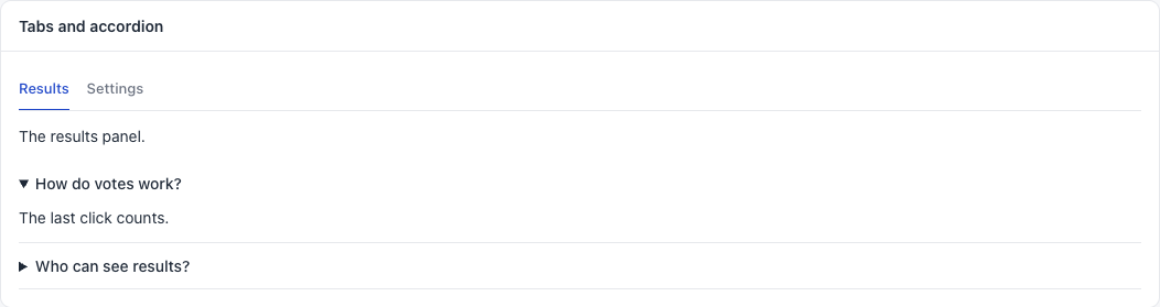
sg-tabs
Panels with a tab for each one. The arrow keys move between tabs.
<sg-tabs id="tabs">
  <div label="Results" value="results">The results panel.</div>
  <div label="Settings" value="settings" selected>The settings panel.</div>
</sg-tabs>
document.getElementById("tabs").addEventListener("sg-tab", (event) => {
  console.log(event.detail.index, event.detail.value);
});
Each child is one panel:
| Child attribute | Meaning |
|---|---|
label |
The tab text |
value |
Your own name for the tab, sent in the event |
selected |
Open at the start. The default is the first panel |
| Method | Meaning |
|---|---|
select(index) |
Opens a panel. Add false as a second value to send no event |
| Event | detail |
When |
|---|---|---|
sg-tab |
{ index, value } |
The tab changed |
Common mistakes. Adding a panel after the tabs draw: it gets no tab. Using tabs for steps that must go in order. Using more than five tabs.
sg-accordion
Sections that open and close. Good for help text and for details that most people skip.
<sg-accordion>
  <div label="How do votes work?" open>The last click counts.</div>
  <div label="Who can see results?">People with access to this plugin.</div>
</sg-accordion>
| Child attribute | Meaning |
|---|---|
label |
The heading |
open |
Open at the start |
It has no events and no methods. Several sections can be open at once.
Common mistake. Hiding the main content in an accordion. If most people need it, show it.