Signal Actions
These components let a person do something.
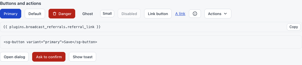
sg-button
A button. Without href, it is a real <button>.
<sg-button variant="primary" icon="plus">New poll</sg-button>
<sg-button>Cancel</sg-button>
<sg-button variant="danger" icon="trash">Delete</sg-button>
<sg-button variant="ghost" size="small">More</sg-button>
<sg-button icon="info" label="Help"></sg-button>
| Attribute | Values | Meaning |
|---|---|---|
variant |
primary, danger or ghost |
The look. Leave it out for the default |
size |
small |
A smaller button |
icon |
An icon name | Shows an icon before the text |
type |
button or submit |
Use submit in a form. The default is button |
disabled |
Present | Turns the button off |
label |
Text | A name for screen readers. Required on a button with only an icon |
href |
An address | Makes it a link that looks like a button |
| Property | Meaning |
|---|---|
disabled |
Live. Read or set it |
busy |
Live, set only. Dims the button and turns it off while work runs |
Listen for a normal click:
document.getElementById("save").addEventListener("click", save);
Common mistakes. Two primary buttons on a page. Forgetting type="submit" in a form: the form does nothing. Reading busy: it has no value to read. Using disabled with href: it has no effect on a link.
Warning
A plugin page cannot open a new window, and it cannot move the whole Broadcast page, because of the sandbox. A link with href opens inside the plugin’s frame. To leave the page, use sg-link with external, or sg.openExternal.
sg-button-group
Puts buttons side by side.
<sg-button-group>
  <sg-button size="small">Previous</sg-button>
  <sg-button size="small">Next</sg-button>
</sg-button-group>
It has no attributes.
sg-link
A text link.
<sg-link href="#details">Read the details</sg-link>
| Attribute | Meaning |
|---|---|
href |
The address. Only http:, https:, mailto:, / and # are allowed. Anything else becomes # |
external |
Broadcast shows the full address, and the person can open it in a new tab. Plain https addresses only |
Common mistake. Expecting javascript: links to work. They are removed on purpose.
sg-icon
A small line icon.
<sg-icon name="gift"></sg-icon>
| Attribute | Meaning |
|---|---|
name |
One of the names below. An unknown name shows the info icon |
check, x, plus, search, copy, edit, trash, download, upload, link, mail, user, users, chart, settings, info, warning, more, chevron, arrow, refresh, gift.
Common mistake. Using an image file for a simple icon. These match the rest of the page.
sg-copy
A value with a copy button. It is the best way to hand a person a merge tag or an address.
<sg-copy value="{{ plugins.local_polls.actions.vote }}" label="Copy tag"></sg-copy>
| Attribute | Default | Meaning |
|---|---|---|
value |
The text to show and copy | |
label |
Copy |
The button text |
| Property | Meaning |
|---|---|
value |
Live. Read or set it. The hover text follows |
After a click, the button says Copied. If the browser refuses, it says Press Cmd+C.
Common mistake. Very long values: the box cuts them off on screen, and the copy still has the full text.
sg-menu
A button that opens a short list of actions.
<sg-menu id="menu" label="Actions">
  <div value="edit">Edit</div>
  <div value="delete" variant="danger">Delete</div>
</sg-menu>
document.getElementById("menu").addEventListener("sg-select", (event) => {
  if (event.detail.value === "delete") removeItem();
});
| Attribute | Default | Meaning |
|---|---|---|
label |
Actions |
The button text |
Each child is one item. It needs value, and it can have variant="danger".
| Event | detail |
When |
|---|---|---|
sg-select |
{ value } |
A person picks an item |
Common mistakes. Using a menu in a small frame: the list can be cut off at the frame’s edge. Listening for click on an item: listen for sg-select.
sg-tooltip
A short hint that shows on hover and on keyboard focus.
<sg-tooltip text="More about this">
  <sg-button icon="info" label="Help"></sg-button>
</sg-tooltip>
| Attribute | Meaning |
|---|---|
text |
The hint. It stays on one line |
Common mistake. Putting needed information in a tooltip. Touch screens do not show it. Use help text for what people need to know.
sg-dialog
A box over the page for one short task.
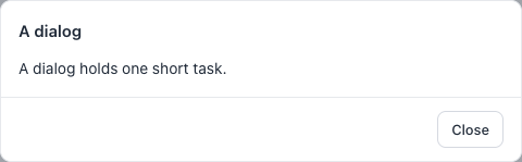
<sg-dialog id="dialog" title="A dialog">
  <p>A dialog holds one short task.</p>
  <sg-button slot="footer" id="close">Close</sg-button>
</sg-dialog>
const dialog = document.getElementById("dialog");
dialog.open();
document.getElementById("close").addEventListener("click", () => dialog.close("done"));
| Attribute | Meaning |
|---|---|
title |
The heading |
| Slot | Holds |
|---|---|
footer |
Buttons at the bottom |
| Method | Meaning |
|---|---|
open() |
Shows the dialog |
close(value) |
Closes it. value is optional |
| Event | detail |
When |
|---|---|---|
sg-close |
{ value } |
The dialog closed |
The Esc key also closes a dialog, and buttons do not close it by themselves.
A close with no value, such as the Esc key, gives "". So you can tell a choice from a cancel.
Common mistakes. Forgetting that a footer button needs your own listener. Building your own yes or no dialog: use sg.confirm, in The sg API. Calling open() before the dialog is on the page.
window.alert and window.confirm do not work in the sandbox. window.confirm always answers false.