Signal Layout
These components set the shape of a page. Most pages use sg-page and sg-card, and little else.
sg-page
The outer frame of a full page. It draws the title, the description and the padding.
<sg-page title="Polls" description="Ask one question in an email.">
  <sg-button slot="actions" variant="primary">New poll</sg-button>
  <sg-card title="First topic"><p>Content.</p></sg-card>
</sg-page>
| Attribute | Values | Meaning |
|---|---|---|
title |
Text | The page title |
description |
Text | One line under the title |
width |
narrow or full |
720px, or no limit. The default is 1120px |
| Slot | Holds |
|---|---|
actions |
Buttons at the top right |
| Default | The page content |
Common mistakes. Using it in a small frame: use sg-widget instead. Adding more than one primary button.
sg-section
A titled group with no border. Use it to group several cards or banners.
<sg-section title="Settings">
  <sg-button slot="actions" size="small">Reset</sg-button>
  <p>Content.</p>
</sg-section>
| Attribute | Meaning |
|---|---|
title |
The heading |
| Slot | Holds |
|---|---|
actions |
Items next to the heading |
Common mistake. Using a section where a card fits. If the content needs a border, use sg-card.
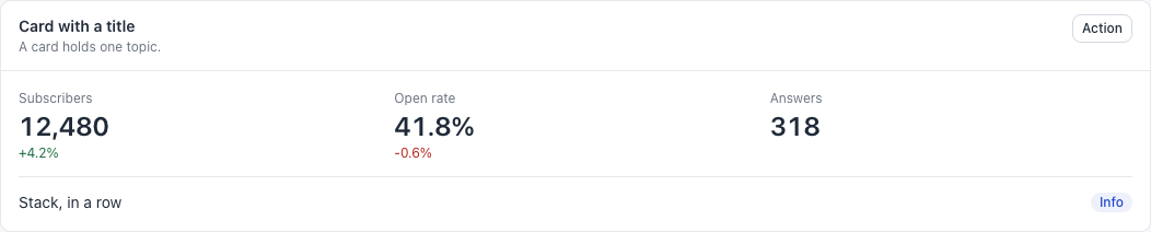
sg-card
A white box for one topic.
<sg-card title="Should we ship it?" description="40 answers">
  <sg-badge slot="actions" tone="success">Open</sg-badge>
  <p>The content goes here.</p>
</sg-card>
| Attribute | Meaning |
|---|---|
title |
The card heading |
description |
One line under the heading |
flush |
Removes the padding of the body. Use it for a table |
| Slot | Holds |
|---|---|
actions |
Items at the top right of the card |
The children are placed in a .sg-card-body box when the card first draws.
Common mistakes. Calling card.append() on a card that is already on the page: the child lands outside the body, with no padding. Build the card first, or add to card.querySelector(".sg-card-body"). Putting a card in a card.
sg-stack
Puts children in a column or a row, with even gaps.
<sg-stack direction="row" justify="between">
  <span>Left</span>
  <sg-button size="small">Right</sg-button>
</sg-stack>
| Attribute | Values | Meaning |
|---|---|---|
direction |
row |
A row that wraps. The default is a column |
justify |
between or end |
Spreads the children, or moves them to the end |
gap |
small or large |
8px or 24px. The default is 12px |
This component is plain: you can add children at any time.
Common mistake. Writing style="gap: 4px". The sandbox blocks inline styles. Use the gap attribute.
sg-grid
Even columns. On a narrow screen, they become one column.
<sg-grid columns="3">
  <sg-stat label="Subscribers" value="12,480"></sg-stat>
  <sg-stat label="Open rate" value="41.8%"></sg-stat>
  <sg-stat label="Answers" value="318"></sg-stat>
</sg-grid>
| Attribute | Default | Meaning |
|---|---|---|
columns |
2 |
The number of columns. Read once |
Common mistake. Using too many columns. Three or four is the most that reads well.
sg-divider
A thin line between two parts of a card.
<sg-divider></sg-divider>
It has no attributes.
Common mistake. Using a divider between cards. The gap already separates them.